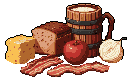
Survival Rations: Pouch, Cheese, Cans - Muted Earth Tones
Pixel art depicts a collection of survival rations, including a pouch of dried food, cheese block, and two cans, rendered in muted, earthy tones. The image evokes a sense of preparedness and nostalgia for classic video game inventory items.
Read More
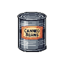
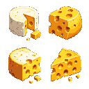
The pixel art image depicts a collection of four items, likely representing survival rations or provisions, presented as if for an inventory icon. From left to right, the subjects include: a soft, crinkly-looking pouch or bag, presumably containing dried food, which is the largest item and stands upright; a smaller, roughly rectangular block of what appears to be cheese or a solidified food bar, positioned in front of the pouch; a cylindrical can with a pull-tab lid, featuring a red band around its lower half and a lighter label above it; and finally, another, taller cylindrical can or container, which has a ribbed or corrugated texture along its side, suggesting a stack of items or a specific type of preserved food.
The items are arranged in a compact group, slightly off-center to the left, within the black void of the frame. The pouch dominates the left side, with the cheese block nestled at its base. The two cans are positioned to the right of the pouch, with the shorter, red-banded can slightly in front of the taller, ribbed can, creating a sense of depth. There is no discernible background or environment; the items are isolated against a pure black canvas, suggesting they are objects for display rather than part of a larger scene.
The color palette is remarkably muted and earthy, dominated by various shades of desaturated beige, grey, and olive green. Specifically, the pouch is primarily a light, desaturated beige with darker grey pixel accents suggesting folds and texture, and hints of pale yellow-orange specks within its contents. The cheese block is a warm, desaturated orange-yellow with darker orange and brown pixels for texture and detail. Both cans utilize a range of desaturated light grey, darker grey, and subtle off-white tones to define their metallic surfaces and shadows, with the pull-tab lid highlighted in a lighter shade. The most prominent accent color is a muted, desaturated red on the band of the middle can. The overall color scheme is monochromatic leaning, with subtle variations of muted, utilitarian tones, evoking a sense of realism for ration items.
The overall vibe of the image is practical and somewhat austere, suggesting readiness or preparation for difficult circumstances. The muted colors and functional objects evoke a sense of resourcefulness and perhaps a hint of post-apocalyptic or survivalist themes. It feels nostalgic for classic video game inventory items, yet also grounded in a grittier reality due to the detailed textures and realistic shading. There are no UI elements or text, and the details are purely focused on the items themselves, from the subtle crinkles on the pouch to the ribbed texture on the tall can and the small pull-tab on the other.


 5
5